
The US Banknote Redesign of 1928
In US banknote design, the year 1928 stands out as a turning point. This was the year that the dollar took on the size and basic design that it still has today.
The change was a long time in coming. Since the early 1900s, there had been discussions about reducing the size of the notes so that 12 subjects would fit on a plate instead of just 8. Such a change would increase productivity 25%. You have to remember that banknote production is limited in part by the size of the plate and how many note impressions you can fit on that plate.
At the same time, there were also discussions about simplifying the designs of the 6 different types of currencies being issued at the time. (These were United States Notes, National Bank Notes, Gold Certificates, Silver Certificates, Federal Reserve Notes, and Federal Reserve Bank Notes.) Imagine all of these different types of US currency having multiple denominations each, and each denomination having a different design. This confusion of designs made counterfeiting easier.
The efficiency movement of the time pushed for not only simpler designs on each note but for the standardization of designs. So, instead of each denomination of each type of currency having a different design, each denomination would have a consistent design across types of currency. Thus, a $5 note, be it a Silver Certificate or Federal Reserve Note, would have basically the same design. The type of note would be indicated by the seal and serial number colors and the printed title of the note.
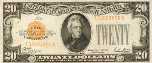
It was at this time that the current set of portraits was selected with Washington on the $1 and etc. Pictured is a $20 Gold Certificate, Series 1928, showing the changes. The decisions made in 1928 continue to affect US currency design to today, 94 years later.